When the USS Enterprise was reimagined with a motion-picture budget during the making of the first Star Trek film, the production’s artists and set decorators had the opportunity to add a level of realism to the ship that had been impossible for their counterparts on the TV show a decade earlier. One of the more subtle touches they added to make the Enterprise feel like a “real” spaceship was to render all the ship’s signage in a standard font. They also created a series of easy-to-understand logos for the various shipboard departments and functions.
For example, just about all the doors on the Enterprise looked the same. How would a new crewmember be able to know if they were about to stroll into a turbolift or a transporter room? Well, each had their unique logos:
. . . and most doors were marked with a sign that incorporated the logo. Any verbal or numeric indication was rendered in the standard shipboard font. You can see what I’m talking about in this screencap:
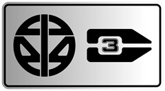
The film’s artists also took the time to create a format for directional signage. For example, how would you know where Turbolift 1 or Docking Port 3 were? A bulkhead labeling system that incorporated the departmental logos, numeric indicators, and arrows was devised:
You see an onscreen example of this in the scene where Spock first comes aboard:

Now, these are just tiny details. They’re barely on screen for a few seconds, and most filmgoers didn’t even notice them. Nevertheless, they worked on a subconscious level to make the Enterprise feel like a huge starship rather than an assemblage of plywood sets.
Ah, but what does this have to do with EPCOT? Well, as I’ve pointed out in the past, since Star Trek:The Motion Picture and EPCOT Center’s Future World were both products of the late 1970s they shared a very similar design aesthetic. Much like the newly-refitted 1979 version of the starship Enterprise, Future World’s signage also utilized a standardized font (known as World Bold) along with a series of easy-to-understand logos representing the various pavilions. This system was utilized on directional signs:

. . . signs on or in the pavilions themselves . . .
. . . and even on the early park guidemaps:
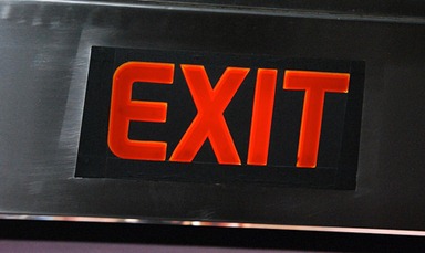
Even mundane real-world things like illuminated EXIT signs were rendered in the official font:
All of this made the various parts of Future World seem like interlocking pieces of an interrelated and greater whole. It contributed, if only subconsciously, to the park’s futuristic feel. Sadly, Future World began to lose its thematic cohesion in the mid-to-late 1990s. The circular pavilion logos disappeared, and as each pavilion was refurbished it gained its own unique signage. That part was understandable. After all, the corporate sponsors would naturally want the pavilion on which they were spending so much money to have its own identity. Less understandable is the way park management seemed to completely jettison Future World’s unified visual design in all other ways.
The signage in today’s Future World is an incomprehensible mish-mash of conflicting styles. For example, some signs still use the classic, still-futuristic-after-all-these-years World Bold font . . .

. . . while other signs use some variant of Chicago, the original Mac OS system font:
. . . and the sign above Guest Relations looks more like something that belongs in the Magic Kingdom’s Flash Gordon-inspired Tomorrowland:
Even during the dark hours of Star Trek V: The Final Frontier, a movie packed with more lazy storytelling and hackneyed plot devices than a whole season of any Glen Larson production you care to name, the folks in the movie’s Art Department still cared enough to make sure that any signage you could see in the background of those creatively-bankrupt scenes fit into the design lineage that began with The Motion Picture:

It’s a level of caring that seems to be sadly lacking at today’s EPCOT. Yeah, I know this is minor thing. The fact is that 99.9% of the park’s visitors don’t notice or even care about signage or a unified design aesthetic as long as they can quickly find out how to get to Soarin’ or Test Track or the Men’s room. Honestly, even diehard EPCOT Center geeks like me wish we didn’t have to care about this stuff.
I mean it. If you traveled back to the 1980s and asked the 10-year-old versions of me or any of my fellow Disney bloggers what we loved about EPCOT Center, none of us would have mentioned the signs. We would have talked about how much we loved choosing our own ending on Horizons, playing in the ImageWorks, or that part at the end of World of Motion where you ride past the mirrored wall and see a reflection of yourself riding in a futuristic bubble car. It was only when that stuff began to vanish that we fixated on the tiny details.
Here’s hoping that one of these days, those details make a return.


The de-futurization of EPCOT through its signage and way finding has been the saddest part of its decline for me. As a lover of the future, Trek and EPCOT have always been closely related and I'm pleased you explored that in this post. In some way, EPCOT Center was responsible for me becoming a communication designer: I was one of those few 9 year-olds who noticed the iconography of EPCOT Center for its cohesiveness, consistency, effectiveness and style.
ReplyDeleteI agree with you that the 1990s signage has been a step back. I even challenge that it has removed what has made EPCOT truly unique. At least the original EPCOT Center signage used visual devices (compositional negative space, iconography, color) that were different from its modern-day context, allowing it to truly feel futuristic or visionary. Star Trek did this as well; its signage and iconography setting it apart from its 1970s production. The current EPCOT signage, by "feeling" 1990s spoils its ability to transport us to a future, leaving everything feeling like it relates to something in the past as in your "Flash Gordon", "Mac OS font, or my favorite, "like 1994 threw up all over it" examples.
Yeah, I'm a geek about this, too. But there's a real grounding for this topic through design: if EPCOT Center and Future World especially stop looking like the future by using imagery that conjures up the past, can they even claim to be about the future?
This is an intriguing topic, and it's really too bad that the signs don't have the uniform approach of the earlier days. I agree that the sense of visual incoherence in Future World now brings down the overall feeling. These are the key details that most visitors don't consciously see, but it creates a certain effect that's felt regardless. It changes the whole demeanor of the park from something unique and original to just a strange combination of unrelated styles.
ReplyDeletewell put. seems symptomatic of a critique that's been around for some time: EPCOT doesn't really know what it wants to be. in 1980, they may not have really known what EPCOT would become or whether it would work. but they knew that even if they weren't going for Walt's original vision that they were going for something. today EPCOT seems a little like a dumping ground for activities and attractions that don't really fit anywhere. would be nice if management tried to answer the question: what do we want EPCOT to be? And that answer needs to be something other than "... a place to put 50,000 people on a busy day"
ReplyDelete